FireForm element data types and their functions
On this page:
- Overview
- Address
- Agreement
- Checkbox List
- Checkbox List (Integrated)
- Currency
- Date
- Date + Time
- Drop Down List
- Drop Down List (Integrated)
- Drop Down List (Multi-select : Integrated)
- Dynamic Content (Integrated)
- Email Address
- File Attachment
- Hidden
- Hidden (Integrated)
- IU Campus Address
- KFS Account Validate
- Number (Decimal 2)
- Payment Basic
- Payment Free Form
- People Picker
- Person Content Display
- Phone Number
- Pivot
- Placeholder
- Pre-populated
- Radio Button List
- Res Contract Content Display
- Sale Item
- Smart Text (Integrated)
- Statement
- Statement (Integrated)
- Survey
- Text (Integrated)
- Text (Long)
- Text (Short)
- Time
- Yes/No
Overview
When creating a FireForm element, you must define a data type. Following are descriptions of available data types with examples of how they are displayed in live forms. Note that the instructions below apply to labels and functionality in the Production (Prd) environment, which may differ from Stage (Stg).
Address
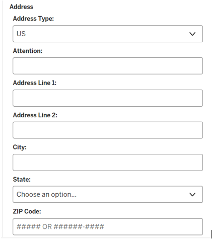
Address is an element type that can be selected to display a physical US or international address on a form. In configuring this element, select as an element type; the "Address Type:" field and a checkbox for "Include Attention To" will be displayed. If you select , your form will include an "Attention:" text box before the address lines.
Address Type options are , , or . The US address type will display "Address Line 1:", "Address Line 2:", "City:", "State:" with a drop-down to select the state or US territory from a prepopulated list, and "Zip Code:". Zip Code will be set to display "##### OR #####-####" on the form. The International address type will display "Address Line 1:", "Address Line 2:", "Address Line 3:" and "Country:". Country will be a drop-down to select the country from a prepopulated list. Selecting will display "Address Type:" and allow the form submitter to select or from a drop-down.
Agreement
The Agreement data type provides a checkbox to let users indicate agreement with a statement. Data is stored as Agreed: XXX, where XXX is the exact text that the user agreed to at the time of form submission.

Checkbox List
The Checkbox List data type provides multiple options for users to select. Users may select as few or as many as they choose.
Options displayed in checkboxes are added to the "List Values" field, with each option separated by a semicolon. An option can be checked by default by adding its list value to the "Default Values" field. If is selected, the user will have the option and a text box (shown below).

Checkbox List (Integrated)
Checkbox List (Integrated) lets an external source be used to dynamically define the checkbox list. This is a complex data type available in FireForm; for instructions on defining an integrated checkbox list, see FireForm integrated data source.
Currency
The Currency data type allows users to enter monetary denominations. Use the optional "Min Value" and "Max Value" fields to set denominational limits.

Date
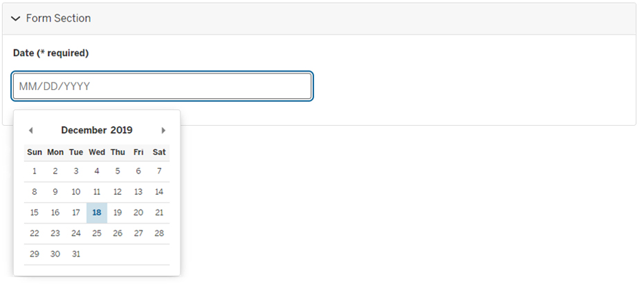
The Date data type provides users with a date entry field and a calendar date picker. You can specify minimum or maximum dates, disable past or future dates, disable particular days of the week, and so forth; these settings are optional and can be used in combination. Use the optional setting to require users to enter a date/time that is at least some number of hours in the future, as defined by the value you assign "Leading Hours". For example, to require users to enter a date/time that's 24 hours in the future, enter 24.00 for "Leading Hours". When "Leading Hours" is used, a short description automatically appears on the form (you can add to the description if needed). Additional optional settings include minimum or maximum dates, disabling past or future dates, disabling particular days of the week, and disabling particular dates.
Date + Time
The Date + Time data type allows users to enter a date and time. You can specify minimum or maximum dates, disable past or future dates, disable particular days of the week, and so forth; these settings are optional and can be used in combination. See the Date element above for a description of how to use the "Leading Hours" field.

Drop Down List
The Drop Down List data type lets users select options from a drop-down list. Use list values to define options; use semicolons to separate multiple values. Use the optional to let users enter an additional value. Multi-select is not allowed in drop-down lists.

Drop Down List (Integrated)
Drop Down List (Integrated) lets an external source be used to dynamically define the drop-down list options. This is a complex data type available in FireForm; for instructions on defining an integrated drop-down list, see FireForm integrated data source.
Drop Down List (Multi-select : Integrated)
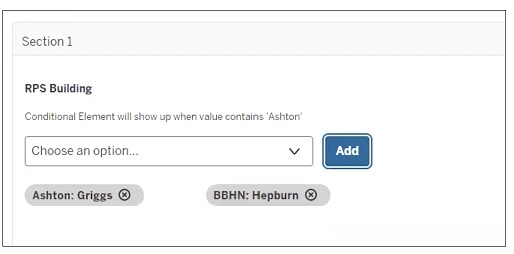
This drop-down list allows users to select more than one option in the list; however, one item must be selected at a time and added by selecting the button. The item will then display beneath the drop-drown list. The integrated feature lets an external source be used to dynamically define the drop-down list options. This is a complex data type available in FireForm; for instructions on defining an integrated drop-down list, see FireForm integrated data source.
Dynamic Content (Integrated)
Dynamic Content (Integrated) lets an external source be used to dynamically display multiple data values and multiple rows of data. This is a read-only display; data types cannot be used as parameters for Key/Value Pairs or URL Switches. It cannot be used in conditional sections or for reroutes. This is a complex data type available in FireForm; for instructions on defining an integrated dynamic content, see FireForm integrated data source.
Email Address
The Email Address data type allows users to enter an email address. This does not confirm the validity of the entered email addresses beyond ensuring that the text entered contains @ and . (for example, username@iu.edu).

File Attachment
The File Attachment data type allows users to upload attachments. Use to specify the types of files users are permitted to upload; use semicolons to separate multiple values. To help users, you can list the allowable file types in the description. The maximum file size is 10 MB for all file attachment form elements. Not all file types are allowed in FireForm (see Attachment file types blocked in FireForm).

Hidden
The form administrator can add the Hidden data type to a form, either one that includes a default value or from a URL query string. The form submitter will not see the field on the form, but the default value content will display on the Form Entry Details page, once the form has been submitted.
Hidden (Integrated)
The Hidden (Integrated) data type works as the Hidden data type listed above; however, the default value will be populated by a FireForm integrated data source.
IU Campus Address
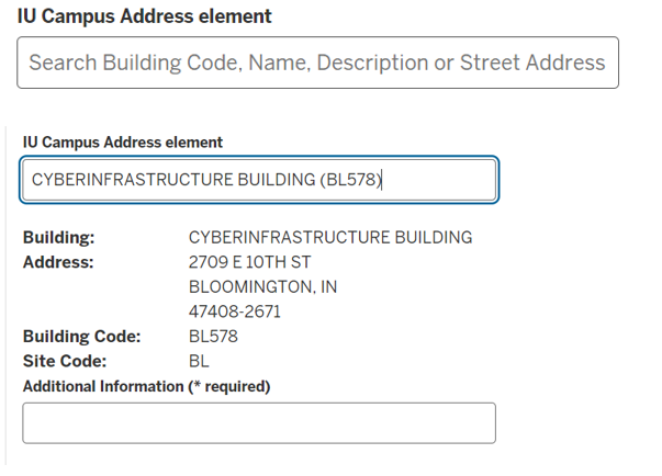
IU Campus Address is an element type that will display the relevant address information for an IU building. This is a type-ahead text box; that is, the form submitter can start typing in a campus name, code, or description, and the list will appear for one selection to be made. Once the submitter selects a building name from a prepopulated list, the physical address, building code, and site code will be displayed on the form.
When configuring this element type, you can check to include an "Additional Information" text box below the site code. If you select this, you'll also have the option to select to require submitters to fill in the text box.
KFS Account Validate
This allows the form submitter to enter a seven-digit KFS account number into a text box. The form submitter can then select the button to display the Account Name, Account Closed, Account Effective Date, and Account Expiration. The form may only be submitted if the account is not closed and is not past the expiration date.
The form administrator has the option to check . This element may be also used with Reroute rules, Conditional sections, and/or Office Only sections. In addition, account approvers may be added as assignees to specific workflow states by checking one or more workflow states listed under "Add account approvers as assignee," and then selecting the , , , and/or for any workflow state.
Number (Decimal 2)
The Number (Decimal 2) data type allows users to enter numerical values with decimals. Use the optional "Min Value" and "Max Value" fields to set numerical limits.

Number (Integer)
The Number (Integer) data type allows users to enter numerical values in whole numbers. Use the optional "Min Value" and "Max Value" fields to set numerical limits.

Payment Basic
The Payment Basic data type allows users to select sale items from a Check Box list or Drop Down list. See above to see how these lists display on a form.
Payment Free Form
This data type allows the form administrator to set a payment amount restricted by min and max amount value validation. If the user enters an amount outside of the defined values, a relevant error will display when the user selects the button.
People Picker
The People Picker data type gives users a way to select a person. When the user begins typing the name or username of a student, staff, or faculty member affiliated with IU into the provided text box, a list of names is populated. The user may select a name, and this will be added to the form field.
To use this element to add an assignee to one or more workflow states, check the appropriate workflow state(s) from the list provided under "Add Response User as Assignee State(s)." Checking one or more workflow states in the "Add People Picker Response User Notifications State(s)" will send a workflow state change notification to the person selected in the people picker on the form.

Person Content Display
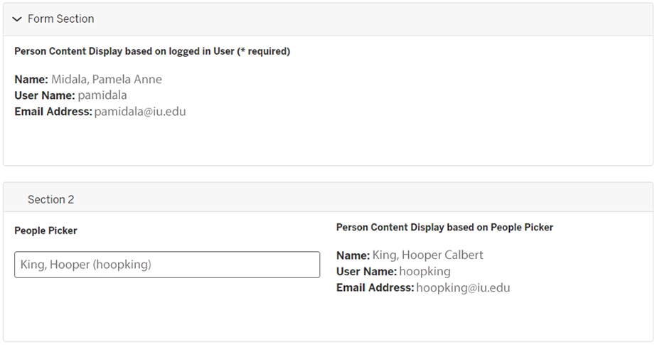
The Person Content Display data type displays information about a user. Selecting a display mode that is or will auto-populate the name, username, and email address data on the form. The UID will also be collected, but it is only visible in the Admin view. FireForm will not permit the UID to be displayed in the Online view for security reasons.
If using , then must be selected in the Form Options. This will populate the submitter's data based on their IU Login.
To use , a People Picker element must first be created (see above). After creation, the desired People Picker element will show in the drop-down when editing the element with the Person Content Display data type.
Phone Number
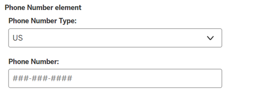
Selecting Phone Number as an element type will display a box for the form submitter to type in a phone number on the form. When configuring this element, Phone Number Type will be required; select from , , or . If you choose , the format will be ###-###-####; if , the format will be +###############. will display a "Phone Number Type" drop-down box on the form and require the form submitter to select their phone number type from either or .
Pivot
Pivots are data sets inherent to FireForm and let you create dynamic and customizable drop-down menus. Before adding a Pivot Type, the pivot sets must be created. See FireForm pivot sets.
Once the pivot sets are created, you may populate the following element fields:
- Pivot Set: Select a pivot set you want to be associated with this element. You need at least one pivot set defined in your app.
- Child of: Select a "Child of" pivot set if you want to develop cascading drop-down functionality.
- Pivot workflow state: Select a form state at which you want pivot functionality to fire. All the states present in the form parent workflow will be displayed here.

Placeholder
The Placeholder data type gives the form creator some flexibility in placing elements on the form. This element will not be visible to end users.

Pre-populated
Use the Pre-populated data type when an external application is passing data back to FireForm in a query string. The data will display in the online form, but the form submitter will not be able to edit it.
To create this functionality:
- Select the element type. Note the ID for this element.
- In your external application, create the querystring, for example:
querystring?id1=JonDoe&id2=32In this example,
id1andid2are the element IDs. The result of this string in an online form would populate the form fields with the text "JonDoe" and "32", respectively, as shown below: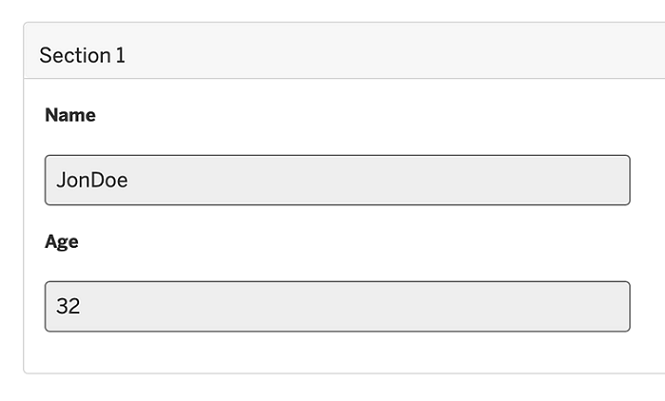
Radio Button List
Use the Radio Button List data type to let users select one option from a list. The Radio Button List will display list items vertically by default; use the setting when creating or editing this form element to change the display to horizontal.

Res Contract Content Display
Currently only the Aux (RPS) tenants display the Res Contract Content Display data type. It has to be turned on at the tenant level and requires approval before using. This will display the student housing contract information.
- Display Mode: Res Contract Content Display can populate data either based on a logged-in user or People Picker. If is selected, the user's information will be prepopulated once they log in.
- People Picker: Only present if is selected as the display mode. Select a People Picker element on the form. Once a person is selected using People Picker, data will be populated for Person Content Display. In order to use this mode, an ACM/Grouper group needs to be defined on your form. Only members of that particular ACM/Grouper group can search a person's residential contract information.
Sale Item
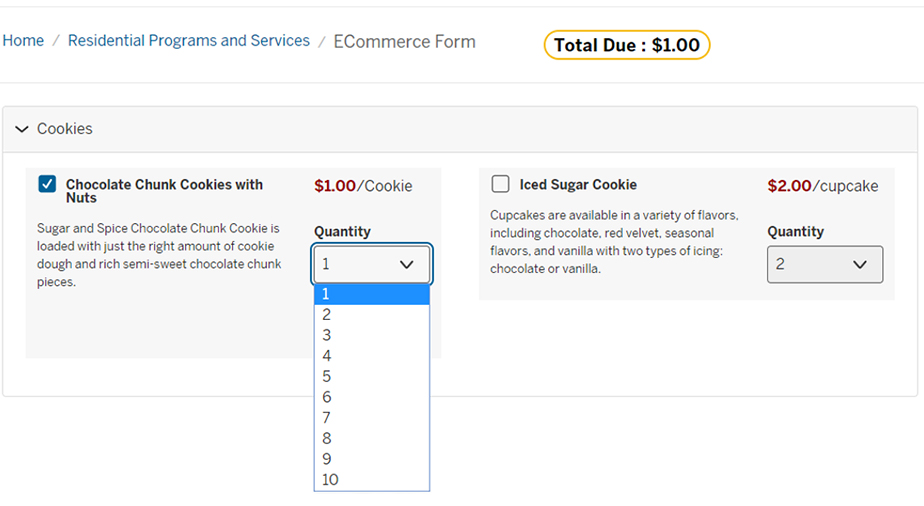
The Sale Item data type populates the form with items that are for sale, with the following additional information:
- Unit Name: Name of the item for sale (for example, "Iced Sugar Cookie")
- Unit Price: Cost per unit
- Quantity: Field options are or . The option provides a sequential numerical list based on "Min" and "Max" quantity settings. The option requires the form administrator to create the list based on quantity values entered manually and separated by semicolons.
In the example below, "Iced Sugar Cookie" is a sale item defined with quantity mode , and the quantity values are 2, 4, 6, 8, and 10.
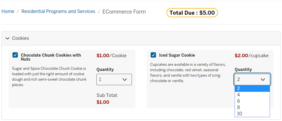
In the example below, "Chocolate Chunk Cookies with Nuts" is a sale item defined with quantity mode ; the minimum quantity is 1 and maximum quantity is 10.
Smart Text (Integrated)
Smart Text (Integrated) lets an external source be used to dynamically provide text suggestions based on what the user is typing into the text box field. This differs from the Text Box (Integrated) in that it also lets the user select more than one option with the button. This is a complex data type available in FireForm; for instructions on defining integrated smart text, see FireForm integrated data source.
Statement
The Statement data type lets the form administrator provide text on a page that is meant to be read only by the end user.
To add a hyperlink to the text, use the following format:
[linked text](https://thisistheurl.edu)For example:
[Acceptable Use](https://access.iu.edu/useragreement/hasagreement)To add an email address to the text, use the following format:
mailto:username@iu.eduFor other text formatting options, see the Markdown Cheat Sheet.
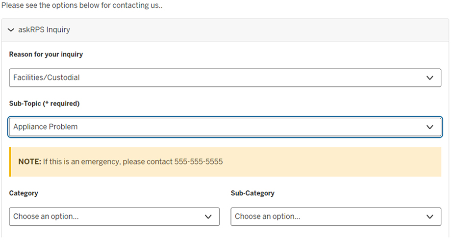
If the option to is selected, the text will be provided with a gold background (as in the note below).
Statement (Integrated)
The Statement (Integrated) data type works as the Statement data type listed above; however, the text will be populated by a FireForm integrated data source.
Survey
The Survey element type will display a one-to-five rating system on the form. Under "Survey Scales", you can edit the text for each of the options in the scale (default values are "Strongly Agree" through "Strongly Disagree"), or remove values to use fewer than five options. Use the drop-down to choose between vertical or horizontal display on the form. Use the drop-down to select whether users will see emojis ranging from very happy to unhappy corresponding to the rating options available; choices are , , or . You can't edit the emoji icons if you choose to use them.

Text (Integrated)
Text (Integrated) lets an external source be used to dynamically provide text suggestions based on what the user is typing. This is a complex data type. For instructions on defining an integrated Text element, see FireForm integrated data source.
Text (Long)
The Text (Long) data type provides the user with a field for a long text entry. The maximum number of allowed characters is 10,000; however, you may reduce this maximum in the "Max Length" box. You may also specify a minimum number of characters in the "Min Length" box.

Text (Short)
The Text (Short) data type provides the user with a field for a short text entry. The maximum number of allowed characters is 200; however, you may reduce this maximum in the "Max Length" box. You may also specify a minimum number of characters in the "Min Length" box. Additionally, you may populate the field with a default value for the user; however, the user may change this value.
To limit the type of text that is entered in this field, use the "Text Options" drop-down list:
To require a specific text format in the form field, select . Then, enter additional information to define the formatting of the field:
- Auto Format With Mask: Define the character type and format. Character options include
#for numbers,$for alphanumeric,@for alpha characters only, and*for any character (for example, use###-##-####for SSN, or1-(###) ###-####for phone number). - Validate With a Regular Expression: For information about learning to format regular expressions, you can refer to How to Use Regular Expressions to Contain Input.
- Regex Custom Error Message: Defines the error message that will be displayed if the user doesn't enter a valid format. This is optional, but if a custom message is not defined, a generic error message stating that the field content is invalid will appear.
If the checkbox is selected (at the bottom of the page), FireForm will prevent multiple forms from being submitted when there is an exact match for this field data. For example, when an account number is entered on a form submission, if someone attempts to enter the same account number on another form, the form will not submit.

Time
The Time data type provides the user with a text box for time entries.

Yes/No
The Yes/No data type provides the user with radio buttons, including only "Yes" or "No" options. If "required" is checked on this element, the radio buttons will default to "Yes" on the form.

Get help
If you have additional questions, need to report a bug, or would like to make enhancement requests for the FireForm system, submit a FireForm Support Request.
Related documents
This is document bfkb in the Knowledge Base.
Last modified on 2024-03-18 14:37:25.